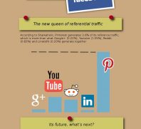
Infographic: The Food Stamp Presidency

One of the keys in understanding any infographic is checking to see how the information – and especially the data – is presented. For instance, in the above infographic, the increase in food stamp recipients under Obama is exaggerated because the baseline is 20 million rather than zero.
Yes, the increase in food stamp recipients in the last four years is very dramatic, but it looks even more dramatic because of the baseline for the current graphic.
While Bush wasn’t a great president by any measure, he did only increase food stamp recipients by half a million as compared to the 16 million new food stamp recipients under Obama (although another source puts the increase in food stamp recipients at only 15 million).
Note: I don’t remember the source of this graphic and cannot read the printing at the bottom of the graphic.